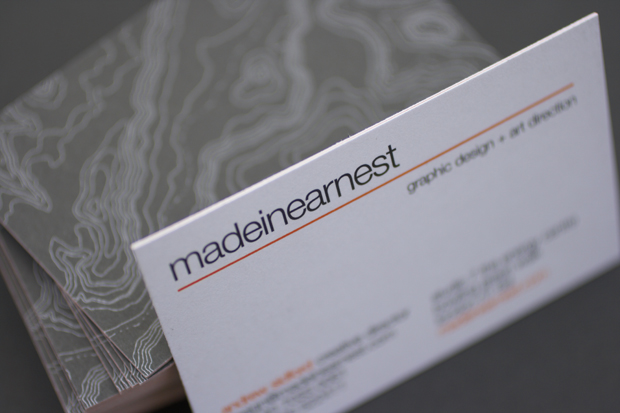
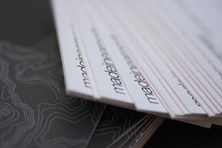
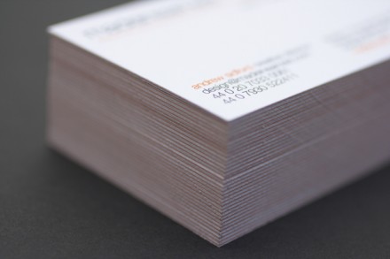
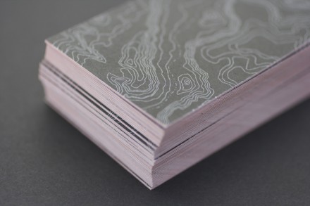
I really liked these cards I had made some time ago. We did them on a thick matt card and sandwiched a sheet of orange in between the front and back, which is actually quite difficult to show in photographs but which looks great when you have the card in your hand. It’s subtle, but the orange is definitely there. I like the way it makes the card look, obviously, and producing them this way makes them feel very very substantial. I’m no Patrick Bateman, but the feel and weight of a business card are important. I dislike those flimsy cards you sometimes get given. In fact, I’d prefer not to get given a card than get one on a stock which is too light.
The reserve of the card shows a white-on-black topographical map, implying that ‘Made In Earnest will help to put you on the map’, or something like that, anyway. Unfortunately (and this is probably pretty much the case with everyone’s business cards), I had too many printed and, having now moved studio, they are sadly defunct. Still, it gives me a good excuse to get some new ones done…


